
The evolution of Hello Alice's visual brand
PROJECT YEAR:
2022-2023
ROLES & RESPONSIBILITIES:
Art Direction
Illustration
Visual Design
Problem Statement
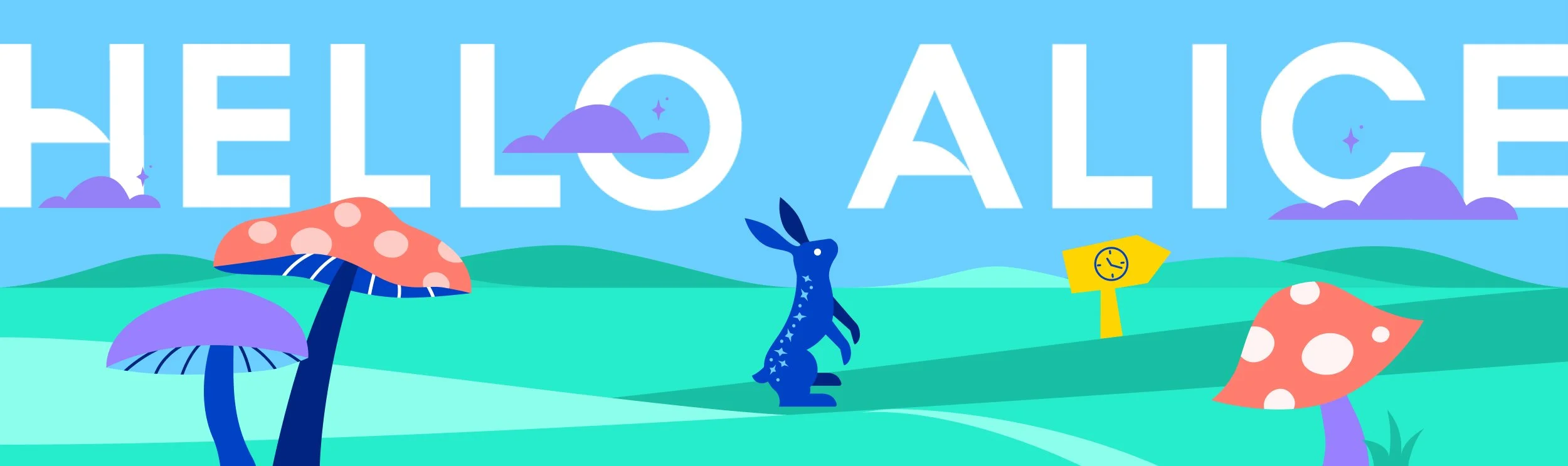
Before my arrival, Hello Alice embraced a whimsical Alice in Wonderland-inspired aesthetic, featuring oblong illustrations, their mascot Ziggy, clouds, and sparkles, consistently applied across marketing assets. As the company grew, this playful style began to feel less sophisticated, prompting a shift toward updating the visual identity.
visual evolution of THE marcom website
1. The initial Hello Alice branding featured early illustration exploration, blending illustrations with photos for a unified visual style. However, the design felt outdated and lacked a polished grid structure, needing refinement.
3. Upon joining Hello Alice, I redesigned the marketing site to align with the product system, introducing a grid structure, refined fonts, a 3:2 image ratio, and a carousel while preserving the whimsical aesthetic.
2. The second version refined the Alice in Wonderland-inspired keyhole header, becoming central to Hello Alice's marketing. Iconography improved for better detail and scalability, but the homepage still lacked a grid structure.
current design for marketing assets
Below is a curated selection of Hello Alice’s marketing assets, featuring oblong-shaped illustrations and dynamic social graphics. These visuals align seamlessly with the marketing website, creating a cohesive visual identity.
Social Media
Printed Assets
what’s next?
As Hello Alice evolves, the cartoon-like illustrations, while charming, no longer fit our brand image. Inspired by the "Forward Focus" campaign, we started transitioning to a blend of photography and subtle illustrations. The following concepts reflect this direction for our marketing assets.
Social Media Mockup
1. I introduced a grid structure for the newsletter with columns and image blocks to enhance information flow and used smaller text blocks for improved digital readability.
While the previous iteration of the newsletter provided informative content, I identified areas for improvement to enhance the appeal and user experience of our Hello Alice users.
2. The second necessary modification involved highlighting the CTA buttons. Previously, these links were embedded within the text, risking reader oversight. Enlarging and widening the CTA buttons aims to capture the reader's attention and will hopefully boost engagement rates.
Newsletter Redesign
Current Design
3. To align with the social media aesthetic, I replaced child-like illustrations with photos for a sophisticated header and used a light blue background to separate sections instead of thin lines.
Redesign Concept
I envisioned graphics with more photography, fewer child-like illustrations, and a new typographic treatment using a white text box for better legibility. Subtle clouds and illustrations preserve elements of Hello Alice’s original branding.